
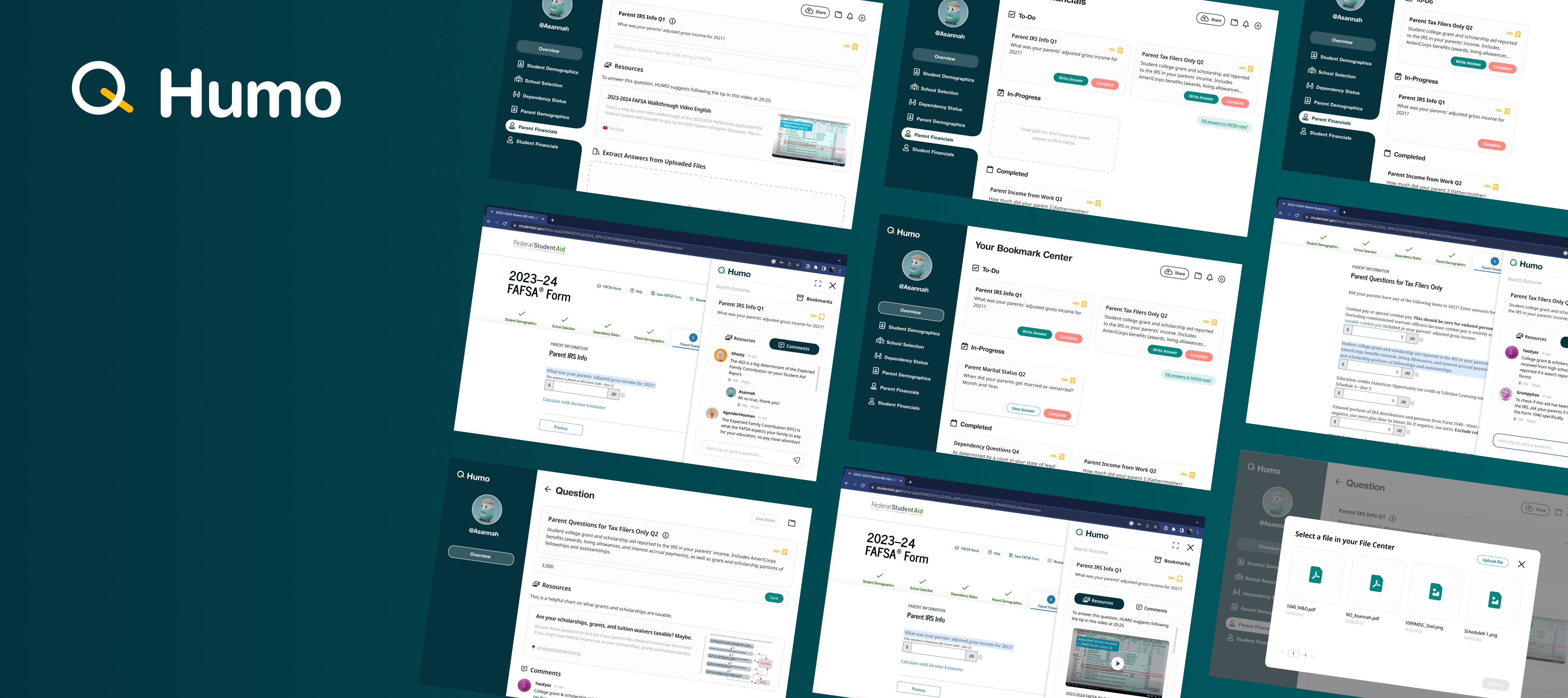
Helping first-time applicants of federal student aid streamline and expedite the FAFSA.
| My Role: | Project Context: |
|---|---|
| UX/UI design lead, User Research, User testing | MS-HCI Program School Project |
| Project Team: | Timeline: |
| 2 designers, 3 researchers | Aug. 2023 - Dec.2023 (4 months) |
In a core course at Georgia Tech, "HCI Foundation," focused on "Government & Civic Systems," I worked with four HCI students as lead designer. Tasked with creating a tool for government or civic contexts, we aimed to innovate solutions for pressing issues. We chose to enhance the federal student financial aid application process for first-time applicants, exploring innovative facilitation solutions.
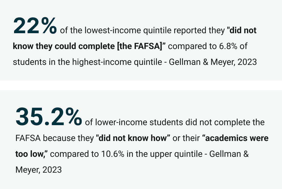
First-time applicants in the U.S. often struggle with the complex Free Application for Federal Student Aid (FAFSA), crucial for obtaining loans, grants, and work-study funding. Misunderstandings about eligibility and the application process make FAFSA seem inaccessible, leading to its underutilization. This especially affects low-income and middle-class students, exacerbating socioeconomic disparities in higher education.
We have developed a main site and a corresponding plugin aimed at assisting first-time FAFSA applicants in completing their applications more accurately and efficiently, whether independently or with the help of a supporter.
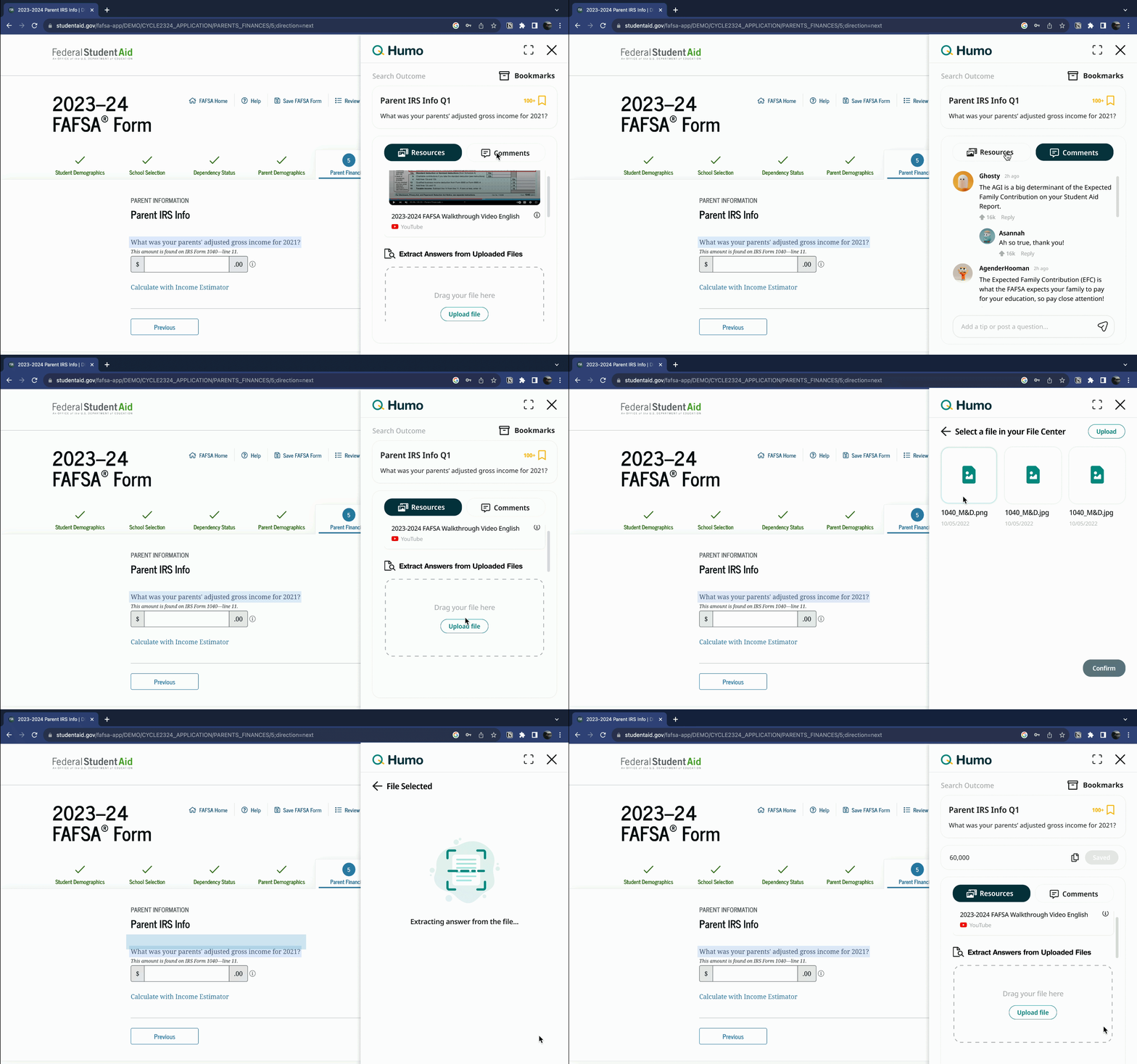
The plug-in serves as an extension of the database main site, but it is also the main system for users when completing the FAFSA application. The plug-in displays tips and resources for specific questions on the form, especially those that are most difficult to understand upon first contact. The plugin will offer access to a text-based extraction tool that can allow users to accurately identify and copy information that is found on external financial documents.
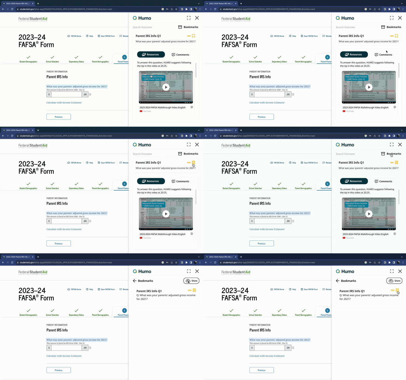
To use the plug-in, users can highlight the question for which they need assistance, which will trigger the visibility of the plug-in. Users will be able to bookmark highlighted questions that they may need further assistance on beyond what they can receive from the plugin directly. They will have access to all the bookmarked questions they have on a bookmarks tab on the plugin window.
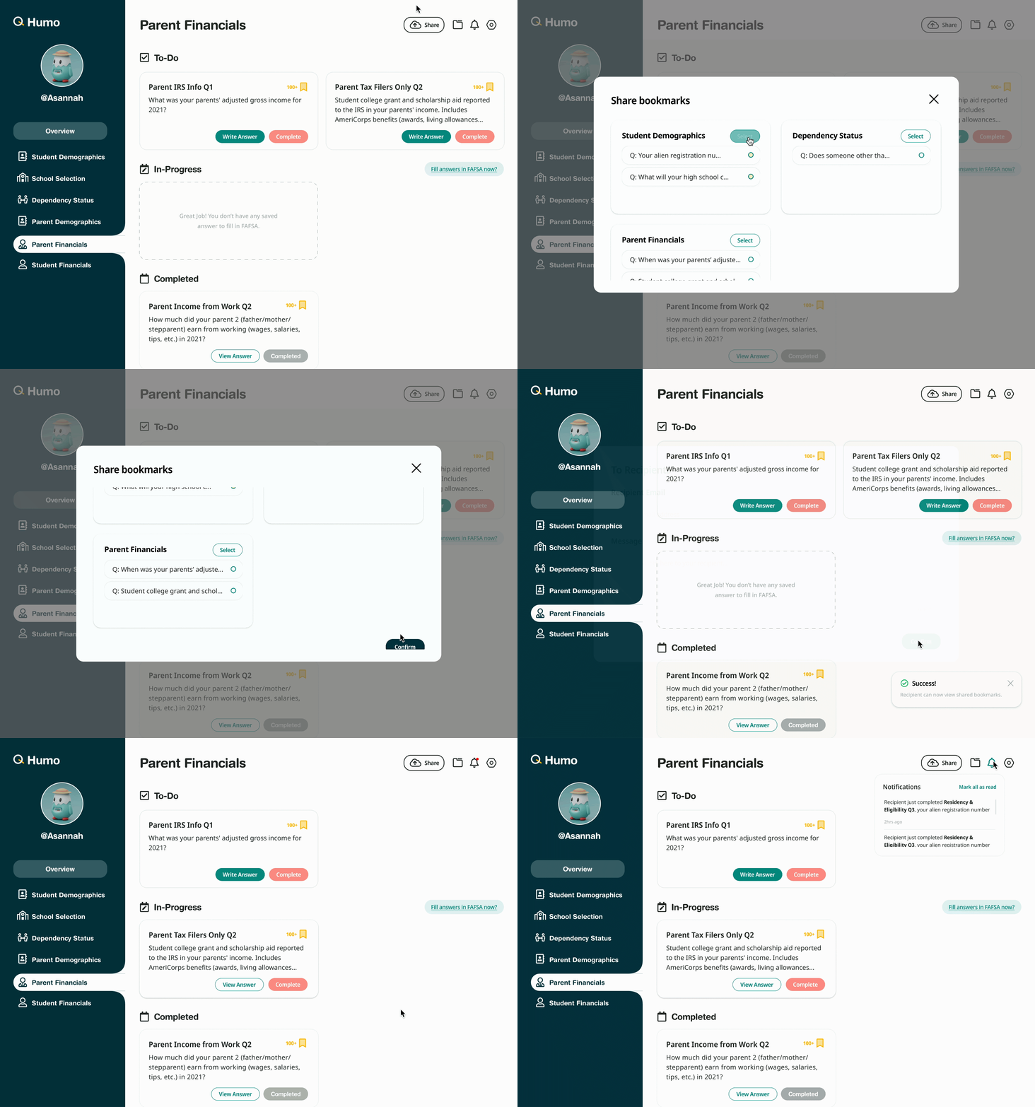
The main site complements the plugin by centralizing the bookmarks users have saved throughout their application process, as well as the files uploaded and shared amongst the user’s network.
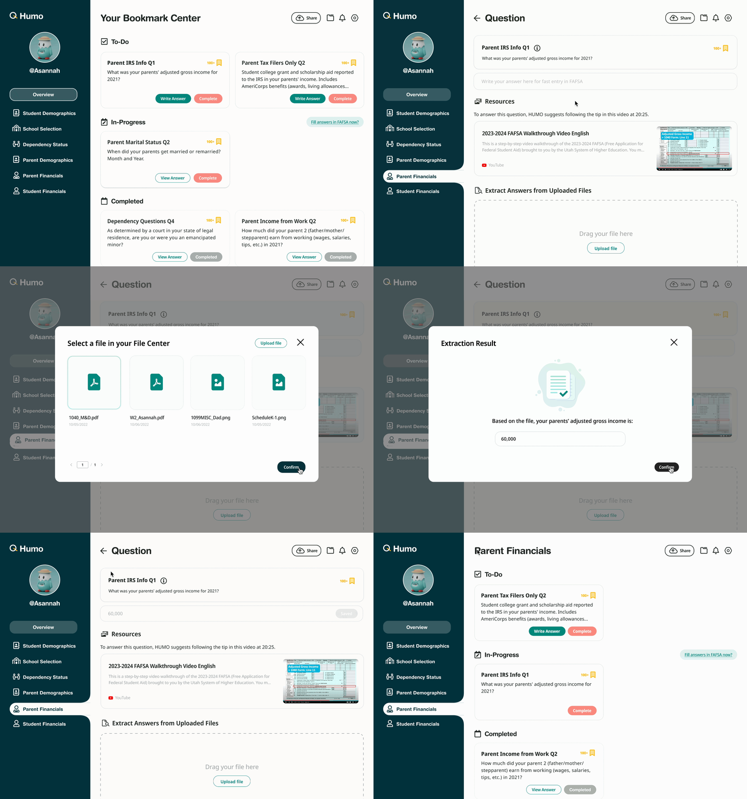
Our product’s file-sharing and bookmark sharing features allow students and parents to asynchronously yet smoothly exchange vital information and trade off responsibilities as the student fills out the FAFSA. For students whose parents or supporters are completing the application on the student’s behalf, the file-sharing and bookmarking features allow data transfer from the students such that parents can fill out the application without needing to interrupt their student.
To better understand the current platform, we conducted an internal audit where we walked through the product by ourselves and identified certain usability issues.

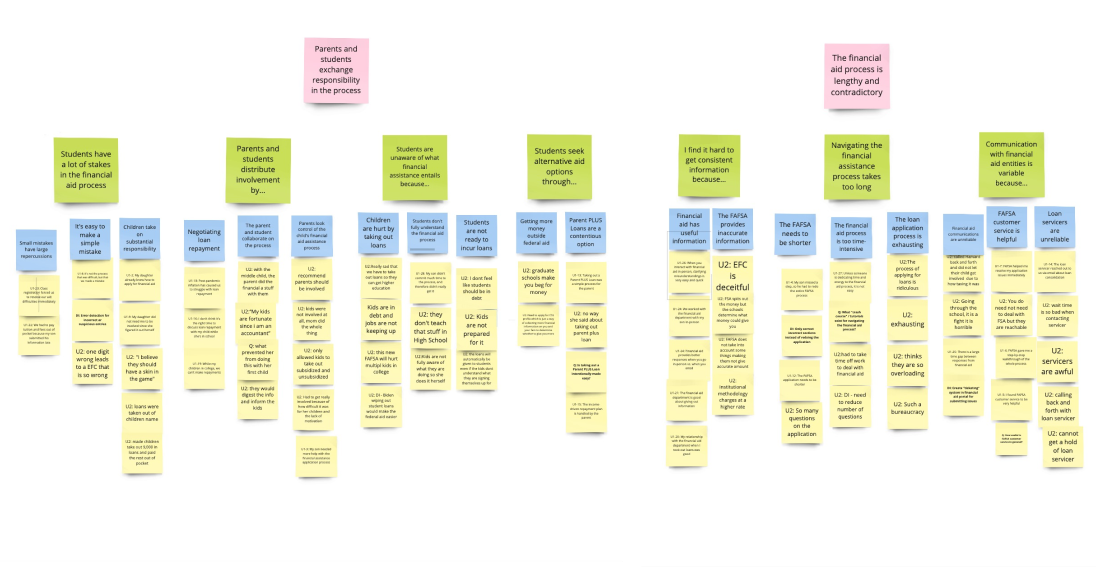
We conducted 50 minutes 1-on-1 semi-structured interviews with 2 parents of students in the financial aid process, understand how stakeholders, primarily parents, affect the successes & challenges of the federal financial aid process.
We employed Affinity Mapping techniques to analyze our interview notes and transcripts. By identifying recurring patterns in user attitudes, we categorized them into distinct themes to uncover common insights.

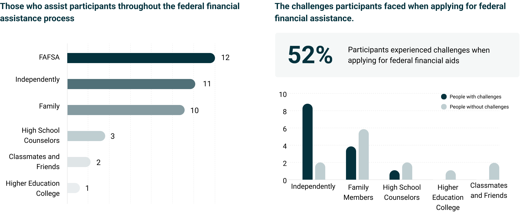
We utilized Qualtrics to conduct a survey, screening out invalid responses and obtaining 28 valid ones. The majority of respondents were first-time applicants pursuing federal financial aid for a four-year degree program.

We interviewed 4 dependent students and 2 family pairs separately to understand their current practices and challenges in applying for federal student aid. We aimed to uncover the factors contributing to successful application completion, including parental involvement.
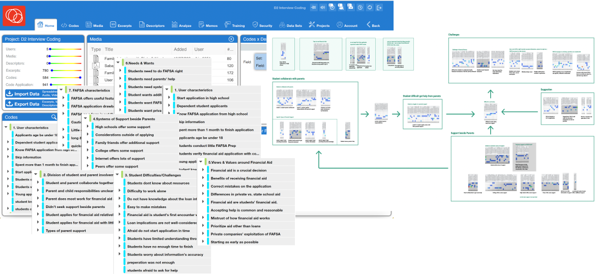
We utilized Dedoose software for collaborative thematic analysis, color-coding interview notes and transcripts to identify 12 key patterns among all eight participants.
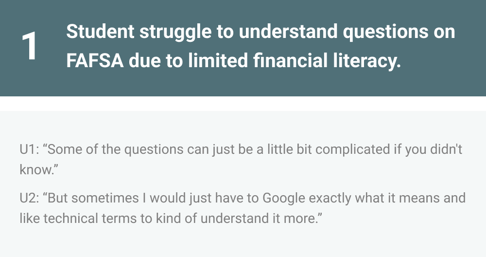
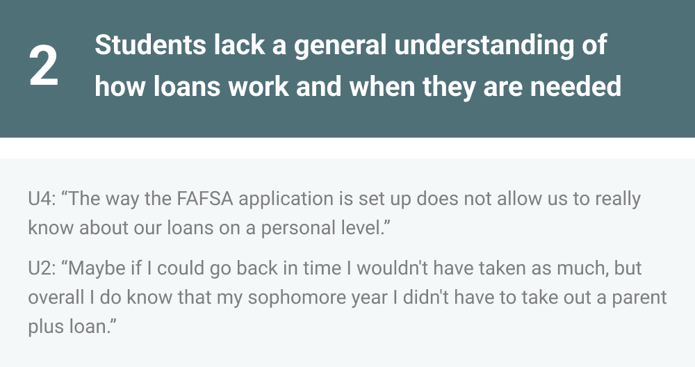


To better understand our users, I created 2 persona named Alex and Kate who reflect the findings within our initial user research.
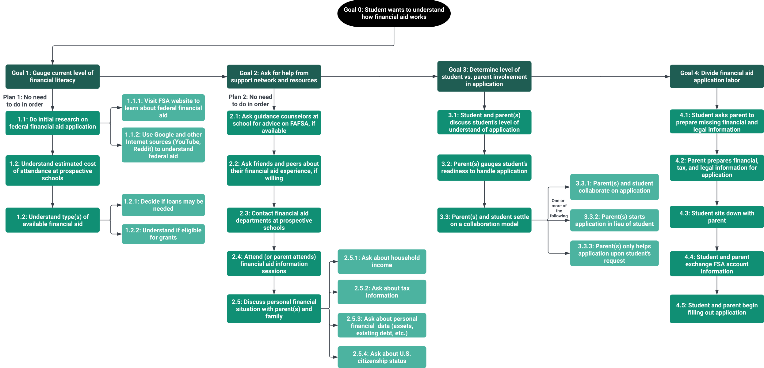
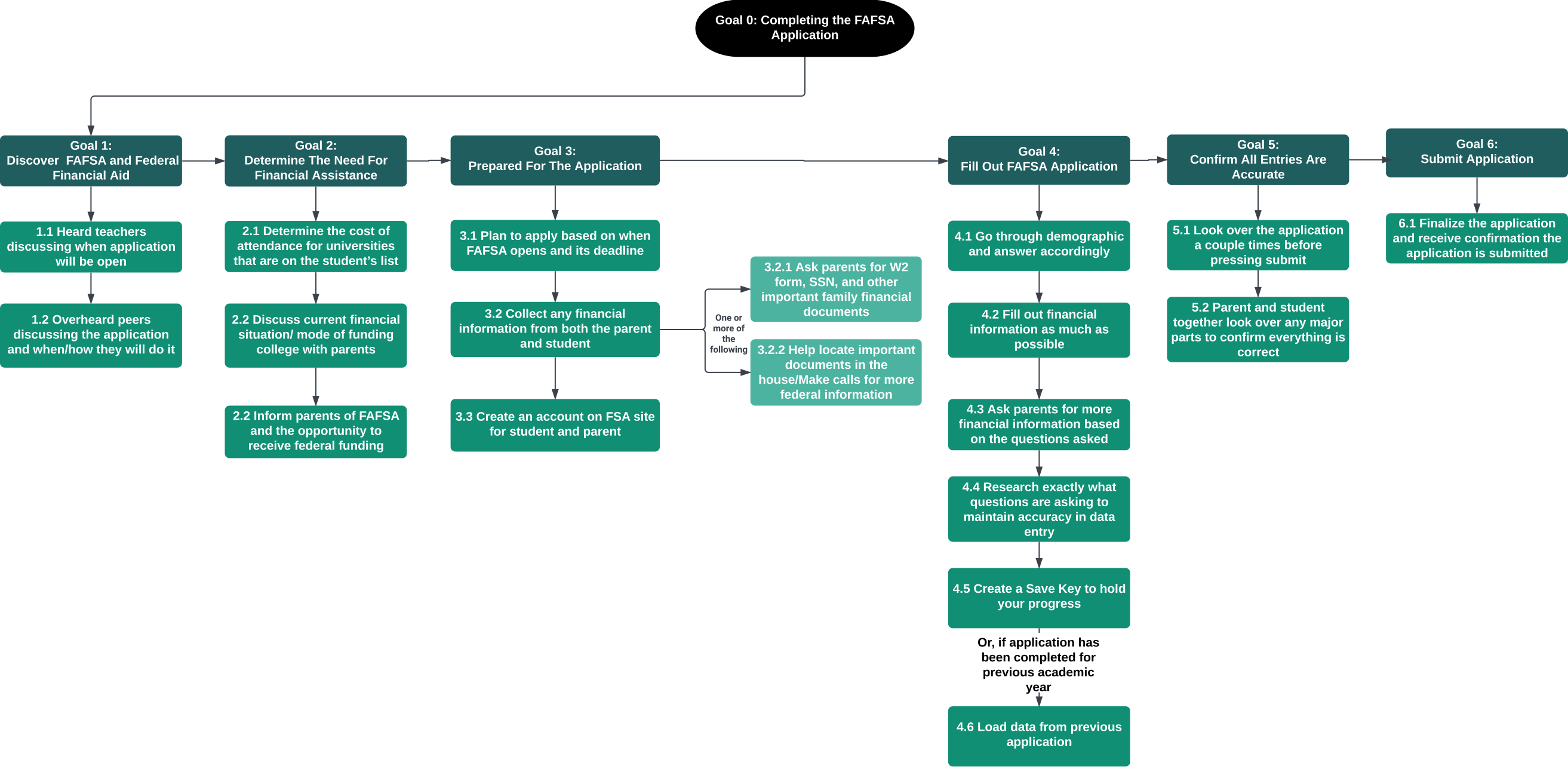
We undertook a task analysis focusing on the steps students and their parents take to both prepare for and fill out the Free Application for Federal Student Aid (FAFSA), using initial research data from both groups. This analysis aimed to delve into how students ready themselves for the federal financial aid application process and navigate the logistics of interacting with the FAFSA application.
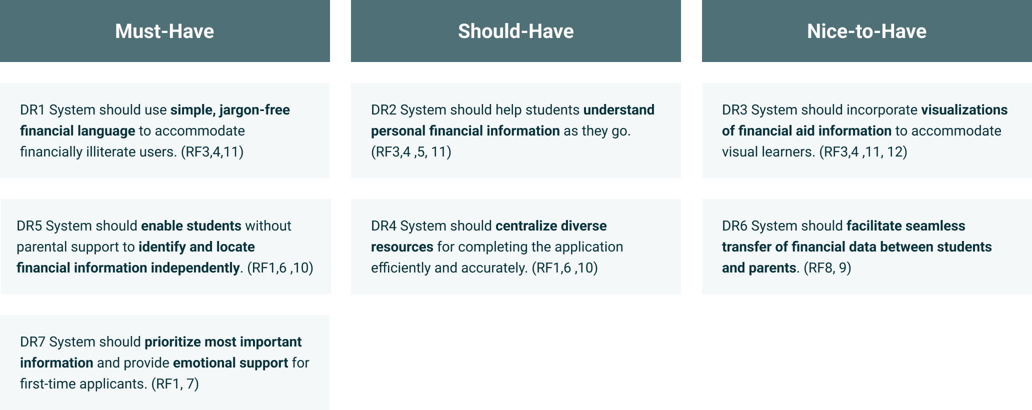
We drew on insights from our exploratory and user research to identify design implications, which informed our design criteria. These criteria were then prioritized based on their importance into "must-have," "should-have," and "nice-to-have" levels.
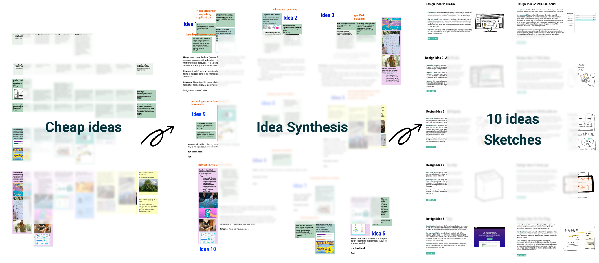
I guided brainstorming sessions with my team using Metaphors and Workbooks strategies, encouraging everyone to independently come up with at least 5 ideas on the whiteboard. After sharing these ideas, we marked the most valuable ones with colored pens, merged similar ideas into new concepts, and I finally developed sketches for the top 10 ideas.
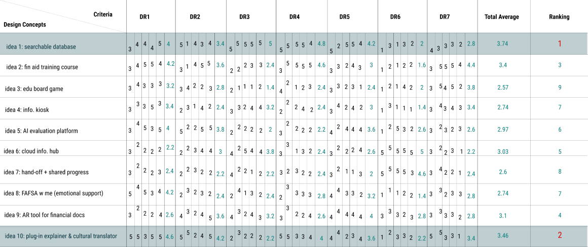
I led our team in using a deicision matrix to rate each of the 10 ideas against our design implications, calculating average scores to rank and select the top 2 ideas.
I created storyboards for the top 2 ideas to illustrate their functionality clearly and help users understand the concepts.
Even though the top 2 concepts ranked highest in our decision matrix, they lacked in supporting student-parent collaboration, an essential element highlighted in our previous research. Consequently, we refined the concept features and structured them to correspond with specific design objectives, which were informed by our design criteria and concept evaluations.
I spearheaded the enhancement of the user flow and personally designed the wireframes to clearly outline the user journey across various features. Following that, we pinpointed four primary user flows to develop low-fidelity prototypes.
I then created the low-fidelity prototypes based on our internal review of the wireframes.

Following that, we conducted an expert evaluation session with six experts to collect feedback on our low-fidelity prototypes before proceeding to the final prototypes. Here is the feedback we received for each user flow's low-fidelity prototypes.
After consulting with mentors and implementing changes to our prototypes, I led my team in refining our style guide, which would be applied to the final prototypes.
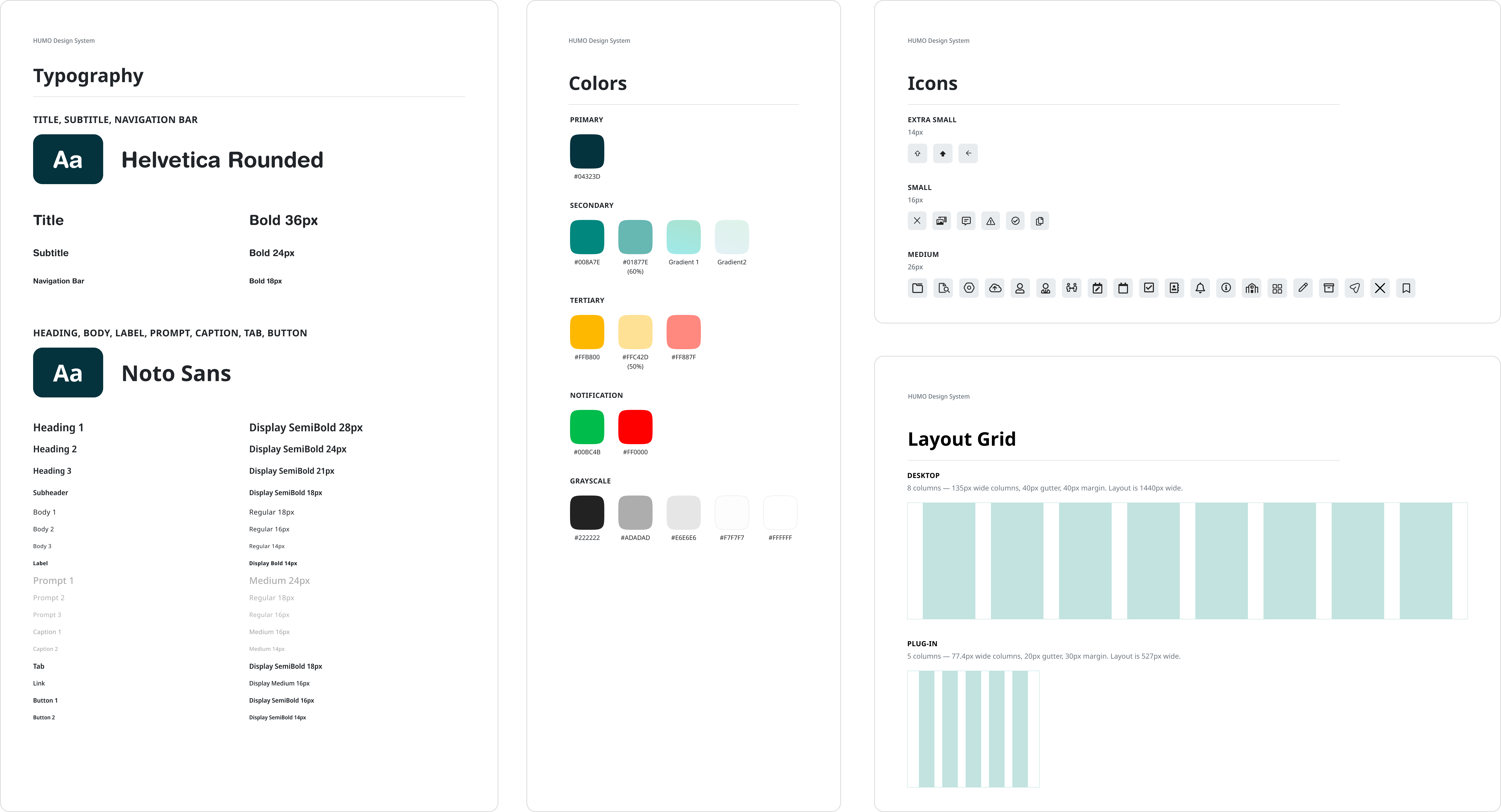
Finally, I collaborated with another designer to co-create the final high-fidelity prototypes based on the feedback we received and the refined style guide.
To assess whether our design solution aligns with our objectives, we conducted moderated task-based testing with five participants, consisting of two small business and two micro business owners. Utilizing think-aloud protocols during in-person session, we assigned them three specific tasks. Their performance was evaluated using both quantitative and qualitative metrics. Overall, the task completion rate was above 75% for each task; the average difficulty rating ranged between 1 and 3; and the average usefulness rating trended towards the maximum value.

Focus on specific problem areas: Due to the FAFSA system's complexity, we should have narrowed down our focus earlier to address specific stages like loan preparation, application, or repayment.
Prioritize user feedback: Early-stage ideation, especially during wireframing, requires extensive user communication to iterate designs effectively.
Stablish a standardized design system: Before creating high-fidelity prototypes, it's crucial to define elements like fonts, colors, layouts, and components to enhance design efficiency and team collaboration.